
Words with Friends
Expanding the forever brand, there was growth opportunity to work with Facebook's Instant games platform to create a lightweight version of the native application. The Instant Games platform was new, tapping into turn based games. We wanted to take advantage of the technology and build something that would reach a broader audience.
To try and solve the challenge of the younger international audience, I explored non intrusive First Time Player Experiences, integrating different ways of playing the standard game with Video Chat, and tapping into features like Streaks that are prevalent on mobile apps.


Word Strength
Overview
Our players were in need of some power ups. Since the instant games platform is a free to play, there wasn't a simple transaction loop to purchase power ups that we provide on the native app.
Deciding on which power ups to reward, we had to look at the play behavior of both our U.S. and International players:
• Strategy: Competition to get the highest scoring word possible
• Aspiration: An intrinsic value allowing players feel like they are getting better
• Learning: Discovering new words players may not have known otherwise
Word Strength is rewarded after players watched a short Watch to Earn advertisement.
Challenge
How to create more deep social engagement that leads to high retention and vitality.
Approach
Test out the Rewarded Video ad format, where players opt in to watch an advert for in game currency.
Outcome
A way to satisfy our player's hunger for new features that can elevate the way they play. Increase the steady 500+ DAU, ensuring that the highly engaged players interface with this feature because of the proven metrics on adverts in facebook instant games platform.
Length of Project
1 month
Role
Lead UX Designer (User Flow & Research, Interaction, Visual Design)
Research
During this stage, I wanted to understand our players' motivations and everyday usage of our game. I also wanted to tap into our target audience to better understand what appeals to them.
Goals/Acceptance Criteria
-
How are they playing the game?
-
How often are they using the match-making feature? (highly engaged players)
-
What long are they playing and how often are they starting new matches?
-
What are our player’s biggest frustrations with the feature?
-
Understand user needs in the game's lightweight model, and to identify improvements
Competitive Analysis
Looking at other competitors, I can break down what other direct and indirect competitors are doing right and what could be done better.

Some key findings and takeaways were:
Players didn't want to feel like their privacy was being sacrificed for a social layer of the game. They didn't want to be put into a group conversation via Facebook Messenger with strangers.
Find the progression for the player journey. For the post D7 retention, players yearn for unlocked content, or a clear progression.
Integration of ads, don't interrupt core game play. Player's time is important, and in these lightweight games, they expect robust play.
Define
The needs and frustrations of our players, while being live, has its positives and negatives. We get the live data to formulate some hypothesis, but the timing to react is always a challenge. I needed to do some research to understand why our players engaged with the feature the way they did.
Goals
Based off of interviews and research, I put together the main goals from the business side and user standpoint. This helped to visualize what goals overlapped and satisfied both sets of goals.

Next steps:
-
Decide what reward we want to give players after watching a Reward Video.
-
Take learnings from Words with Friends, what were the highly engaged rewards (either earned or bought) and why players use them.
Spoke to the native Words with Friends team to collect data on power ups used in the game. Which power ups were highly engaged? Why did players use them over others?

Ultimately we decided on choosing Word Strength, as it was the most engaged benefit players were open and willing to use. The value in finding the most powerful word at low to relatively no cost, made positive impacts in a player's strategic play.
The next steps was to figure out where to integrate this new power up, while not interrupting normal game play. I needed to find placement, embedded somewhere where it would be heavily used (on the game board).
I created a site map that incorporated the new prioritized items listed above.


Wireframes:
After making some prioritized goal sets, I was able to make some determinations on user flow. From there, I put together wireframes to understand key access points. We want players to interact with it, but not be the primary focus on the game board.

Interaction & Visuals
Low Fidelity Mocks
Through quick sketches, I explored various visual interpretations of how we display a word strength meter. We also knew we would place this feature right in the game board, but took a different approach from native. We wanted it to be an explicit power up, so giving it its own space, it would have more exposure.

Meter interactions and visual treatment of gauge
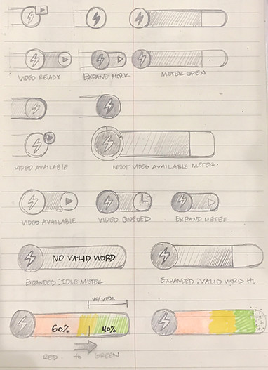
Meter behavior and visual indicators ideas

Intro to feature, reward animation
Meter location in tile tray area


Meter location in player/opponent area
Prototyping:
Creating click throughs within Sketch and Flinto, helped to create test cases and usability sessions. We did several iterations on how the meter would behave, and where it was located. We ultimately found, through usability tests, that placing the meter closest to the tiles (where players are interacting the most on this region of the screen), related the two key elements together.
High Fidelity Mocks:
In parallel with prototypes, I created mocks on the other iterations of meter placement and visualization. We knew it was best to keep placement close to tile tray, but wanted to see if making the meter stand out more would be enough of a read to make it as impactful. Also wanted to test and see if it made more sense to be closest to the Reward Video entry point and make a case around that theory.

Final Mocks:
We ultimately went with the green icon to have parity between the instant game version and native version. The meter was housed within the tile tray to relate the tiles, word strength, points/word validated label together.

Results
Well Received
The feature was well received, with a lift in DAU and increase in game creations. The audience is skewed more towards the 20-30 age group, which highlights how open players are to more strategic play, and competition. Engagement was slightly higher in the Instant Game version.
In the next version, based on feedback and metrics, we should see how often players are using this feature. Since the power up expires after 30 minutes, we should see if players are repeat consuming these rewards. If this is successful, we can expand this to other in game rewards.
Next Steps
Tutorializing Feature
For existing players, surfacing new features such as Word Streak should be introduced, yet not overly forced. I thought of ways we can accomplish this with a new character design for all tutorialized pop ups. Below, are some character designs I came up with through exploring completely new NPC's and well known profiles.

