
Solstice Arena
One of the first MOBA's on mobile known for quick battles for shorter, more casual player sessions. A 3v3 battle to eliminate the opponent's towers first, finding the right balance of characters in a team is key as each has their own unique abilities. There are three different game modes, PvP, Co-Op, and Solo, that gave players breadth of game play and strategy.
Solstice was cross platform, reaching to mobile devices and tablets, as well as PC. I helped design the experience from game mode selection to combat. Our main focus was to provide a seamless experience between different platforms, so a player on mobile can have relatively the same experience on PC.
Background
I wanted to take on new challenges and this project had a lot of opportunity to explore cross platform play, involving mobile and web, and a complex genre. At that time, Multi-player Online Battle Arena (MOBA) games were primarily developed on PC. The team wanted to fulfill some high level goals, providing a high quality and well balanced game that appeals to both hardcore/midcore players and broaden the genre to a wider audience.
Game
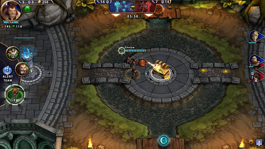
Solstice arena is a 3D fantasy themed 3v3 MOBA where players go into battle to take over the opponent's towers before theirs are destroyed.
A roster of heroes, ranging from tanks to melee, give breadth of different playstyles that players can choose based on the game mode they desire . Each hero can cast their own spell type from a set of three attacks. Depending on play style, a player may specialize in one attack over the other through investment. Throughout the game, there are objects in the arena that heroes pick up to increase attack or heal.
Player Work Flow
We wanted to ensure the hero selection flow from a game mode wasn't too extensive. Since players really just want to start a battle, I had to balance the right set of options that set the player up for success as well as the hero story. Visual Hierarchy helped lay out the possible taps it would take from game mode selection to confirming hero selection. This helped me organize the information in batches and how many taps it required a player to get to each part of the flow.

Wireframe
I then made wireframes based on each screen corresponding to decision making moments. This includes promoting heroes and their skins, ability upgrades, adding buffs, and inviting friends. In addition to the content, it helped me plan out where we add story and to balance blocks of text that becomes challenging in the mobile space.

Visual References
I spent some time researching games in the familiar space, referencing visuals and universal UX norms. Some games I looked at included MMO's and MOBA's. I wanted to bring that high quality fantasy feel, to match the 3D art style. I focused on textures to give the UI's a rendered look.

In-Game UI
The game's theme was a rendered 3D fantasy art style. We wanted to carry that through the entire game, though ensuring that there was a balance between content legibility and breadth of visual styling. I wanted to bring forth textures that signified certain UI elements. For instance, I used a fantasy card-like styling anywhere we described hero content and roster of heroes.


Controls
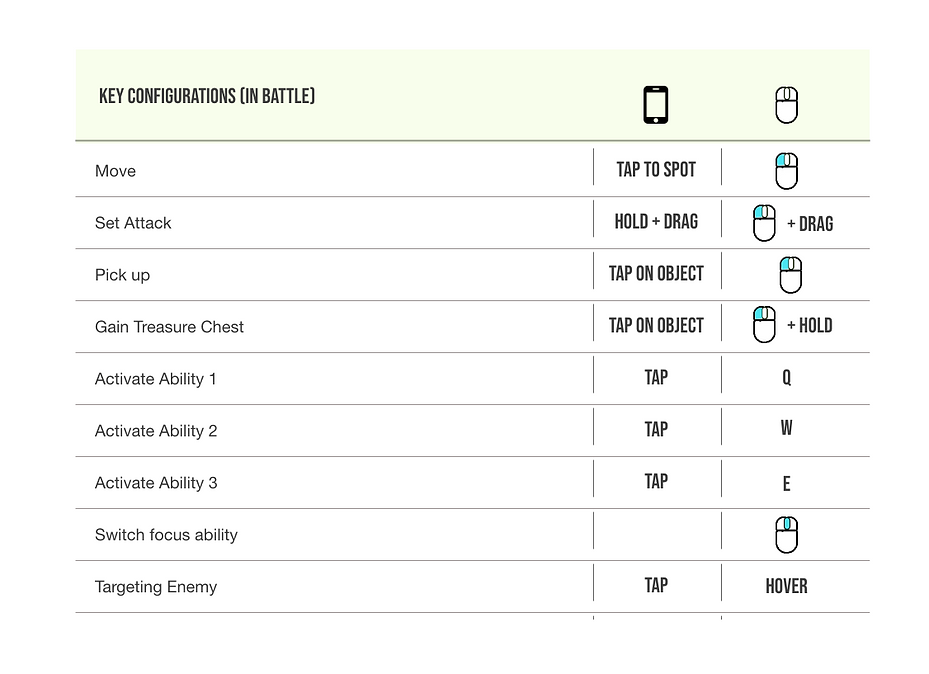
Cross platform controls were important to the project. We wanted to ensure that a player on PC/Mac had the optimal experience compared with a similar experience on mobile, catering to each platform's standard. If a player switches between platforms, the experience should be seamless. The main goal was to create a leveled experience, and that not one platform felt more powerful than the others. I did a cross comparison of these controls in the arena space.
Visual Assets
I created these assets to be scalable, to keep atlas sizing and game footprint low. I set most of these assets to be 9-sliced in Unity. As all of the art assets were created in-house, I ensured to maintain modularity so that we didn't have to re-create assets. Below, are some of the included assets related to the battle type selection and character flow.
