Harry Potter: Wizard's Unite
A location based game using Augmented Reality to immerse the player into the world of Harry Potter and the Wizarding World. Harry Potter appeals to a wide audience, nearly reaching over half a billion fans. Warner Brothers, which licenses the Harry Potter franchises, knew we could connect to the fans in a unique way. The virtual world invites players to be part of a force banded together to go against the Calamity. Fighting against enemies, collecting creatures, and crafting potions are some features that appeal to all player types and ages.
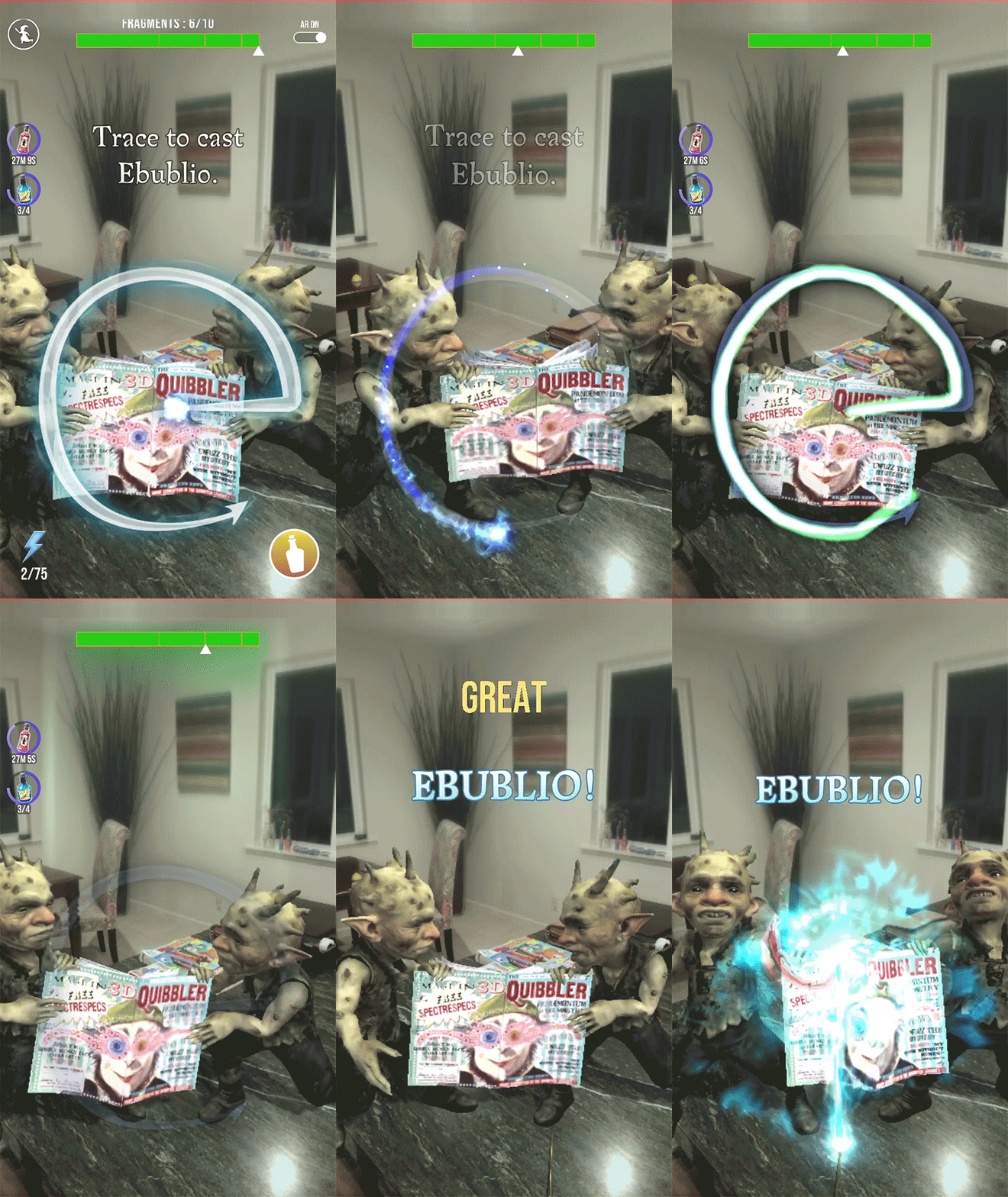
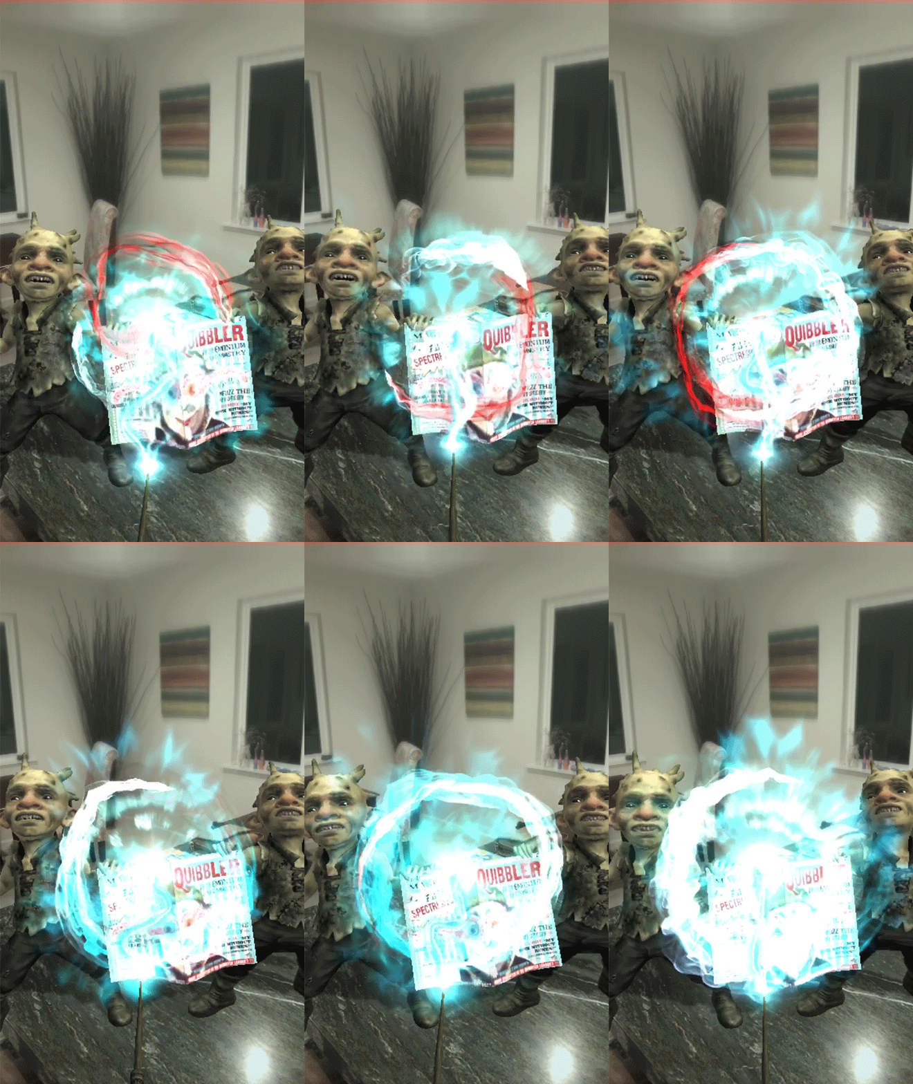
Since AR has its challenges with keeping UI's balanced with the in-world, I found that simplifying the interactive elements and plussing up the player feedback was needed. I explored balancing primary/secondary/tertiary elements based on high interactivity regions and modular systems.


Wizarding Challenges: Synchronous Play
Overview
Playing with a team of friends to defeat enemies together was something we wanted our players to get into organically. This synchronous game play was intended to give elder players a strategic outlet while keeping it accessible to the casual player. I explored ways to display rewards our players can receive and making the combat system feel robust, with player facing reward items and displaying live status of player participation.
This greatly increased player engagement and appreciation shown on discord and our social media outlets.
Challenge
How to increase player engagement, including re-engagement of existing players, in wizarding challenges.
Approach
Determine what can make Wizarding Challenge more compelling, through collectively pulling together player sentiment and telemetry.
Outcome
A true synchronous game mechanic that enhances the social experience of playing together and clearly express the value of interacting with this feature.
Length of Project
Built in several phases
Role
Lead UX Designer (User Flow & Research, Interaction, Visual Design)
Research
The needs and frustrations of our players, while being live, has its positives and negatives. We get the live data to formulate some hypothesis, but the timing to react is always a challenge. I needed to do some research to understand why our players engaged with the feature the way they did.
Goals/Acceptance Criteria
-
What is the data telling us?
-
Who is playing the feature and how are they playing it?
-
What are our players interacting with more and what motivates them?
-
What are our player’s biggest frustrations with the feature?
-
Of the players that haven’t interacted with this feature, why haven’t they done any challenges?
Competitive Analysis
Looking at other competitors, I can break down what other direct and indirect competitors are doing right and what could be done better.
The following analysis provided some key insights:
Social: match making and instant battles are desired. Players want to access battles and feel like they are playing together.
Incentive: Players want to be able to have a sense of what they’re getting when they win a battle. Whether it is an intrinsic value of winning a region and defending it, or a meaningful reward, they want to ultimately know what they’re getting after.
Progression: Players want a challenge and to know their skills are getting significantly better by playing more and paying attention to the meta game. As you get better, the battles get more difficult.
Preliminary Personas
Creating high level personas, based off of research and data points, helped to understand the needs from different parts of our audience. We are appealing to a wider audience, but based on metrics, we see a divergent in player types. Each player type has varying needs, by doing this exercise, we can get closer to responding to the problem.
Research: Interviews
I wanted to conduct some interviews to better understand the needs, frustrations, and reasons the player has while playing this feature. I wanted to to get a wide range of feedback from a hard core gamer to a more casual one.
Interviews
To test the preliminary personas, I interviewed people that have played the feature in varying capacities. I wanted to learn how they interacted with the feature, what they enjoyed, and what were some pain points.
Research Assumptions
-
Some players are familiar with touch gestures from similar competitors
-
Players are open to other features in the game
-
Play primarily on mobile handsets
-
Have played cooperative play or any social type game mechanics
Upon writing down all feedback, I collectively imported them into a spreadsheet and grouped them on type.
I then placed feedback on sticky notes to find trends and behaviors that became sticking points for players. I noticed similar sentiment, which generated more attention to solving issues surrounding that behavior.
Define
Goals
Based off of interviews conducted and live game metrics, goals from the business, user, and game improvements perspective evolved. Each group is equally important. This exercise helped to inform overlap that affected all stakeholders, as well as finding the trends.
Information
Architecture
We built a high level feature set to further define and support the vision. Analyzing the data allowed us to create a prioritization of how we wanted to solve the issues in pieces to reach our players in a timely manner.
I created a site map that incorporated the new prioritized items listed above.
Interaction Design
To start off, I wanted to visualize how we want to funnel players into the challenge with the new updates in mind. Through player flows, I identified where there were additional edge cases and states missing.
I updated the Site Map as the flow updated and as we kept adding functionality from the priority list.
Wireframing
I jumped right into wireframes after understanding the structure and additional screens needed to support the design. During this process, I thought about a layout that would support both the business and user goals in a technically sound way. This was placed in a design deck, reviewed and referenced by stakeholders, as well as QA verification.
Interaction & Visuals
High-Fidelity Mocks
From the wireframes, I created high fidelity mock ups, testing out new UI elements, and reordering some of the layouts. Based on some of the learnings from the user tests, we made some assumptions on placement of main call to actions and visual hierarchy.
Usability Test
I set up a prototype of the proposed flow and interviewed both internal and family/friends. I wanted to see if people understood the new flows and to talk about what was confusing.
Tasks included:
-
How do you think you can start a challenge?
-
Do the various states of teammates make sense?
-
When you are on the lobby wait screen, what other actions can you take other than starting a challenge?
-
What is your expectation when you tap the "Start" button?
Findings
With the first set of mock ups, on device, we realized that the buttons on the player cells in the lobby, were not fully understood. After figuring it out by tapping on the buttons, with some previous player knowledge from other combat type games, they got the behavior. Some of the feedback focused on the difficulty to know who was who in the list. So, the join button wasn't prominent on the screen for them.
Recommendations:
-
Rethink the player's CTA and make it more prominent compared to teammates
-
More player feedback on teammate activity
-
Increase timer so players don't feel rushed to start a challenge before they are set up for success
High Fidelity Mocks: Final Round
After compiling the feedback, we took another pass on the layout and went through another round of user tests. We reserved the button visual to just the player (not the teammates). Since there is no action to be taken on Player 1's screen, we removed the complexity of the teammates activity. Teammate activity, from Player 1's screen, includes a waiting animation (three dots looping) and a checkmark that has a lightweight pulsating micro interaction.
We also took a stab at enabling rewards on the chamber select screens to promote chamber level progression.
Results
Key Findings
Based on community reports and metrics, engagement with the feature and player sentiment was positive. On the business side, there was an uptick on challenges successfully completed through rewards earned, and level progression through the chambers. Players loved that they could wait to have friends join before starting a challenge.
A Response to COVID-19
At the onset of the global crisis, players shifted in their game habits that disrupted the intended experience of the game. We saw declines in cooperative engagement and event completion rates, driven by players ultimately sheltering at home and limiting in-person meet ups. Recognizing this change, our team responded by expanding access to key game modes for our players. For Wizarding Challenge, we knew it was imperative to add a layer of access beyond the map-based experience. So, we created a special server that any player, trying to engage with Wizarding challenge, had a way to battle together with others that needed a team.
Results 1 Month Post-Launch
Knight Bus became the primary method or participation in Wizarding Challenges, and especially during event days. Players are engaging with the feature as intended. We saw that players were using up more potions while battling, particularly the healing buff. Increased Wizarding Challenge participation still driving a large portion of overall increase in Energy sink, which is a required resource to play.


